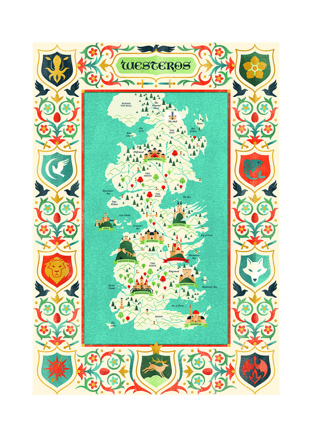
I have been working on illustrated maps for a while and I always wanted to share with you my process. I will use as an example the map I illustrated for Westeros, the world of Game of Thrones TV series and the Song of Ice and Fire books.
Illustrating maps can be quite difficult. It depends on a lot of things. First, the size of the city/region/ country. Second, the load of information you want to convey. And last the style of the illustration should somehow match the theme of your map. Matters can be even more complicated if you work for clients, but maybe I will write another post on this topic.
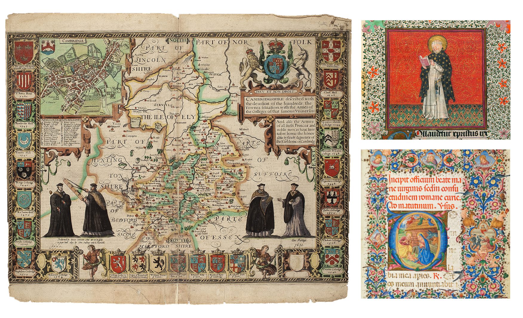
I usually start every project with tons of research. Getting to know your subject I think can be crucial. This time around I’ve thought I know a lot about Westeros by reading the books. Turned out I was wrong. There is always more to learn from Wikipedia (or the Wiki of Ice and Fire.) For those of you who are unfamiliar with the work of George R. R. Martin – Westeros is a fantasy kingdom mostly based on medieval England and Europe. So I searched for real maps and codex pages from this time period and found some beautiful artworks.
Then I set a brief to myself. I wanted to create a map based on medieval traditions but the outcome should feel modern using vector graphics and handmade textures.
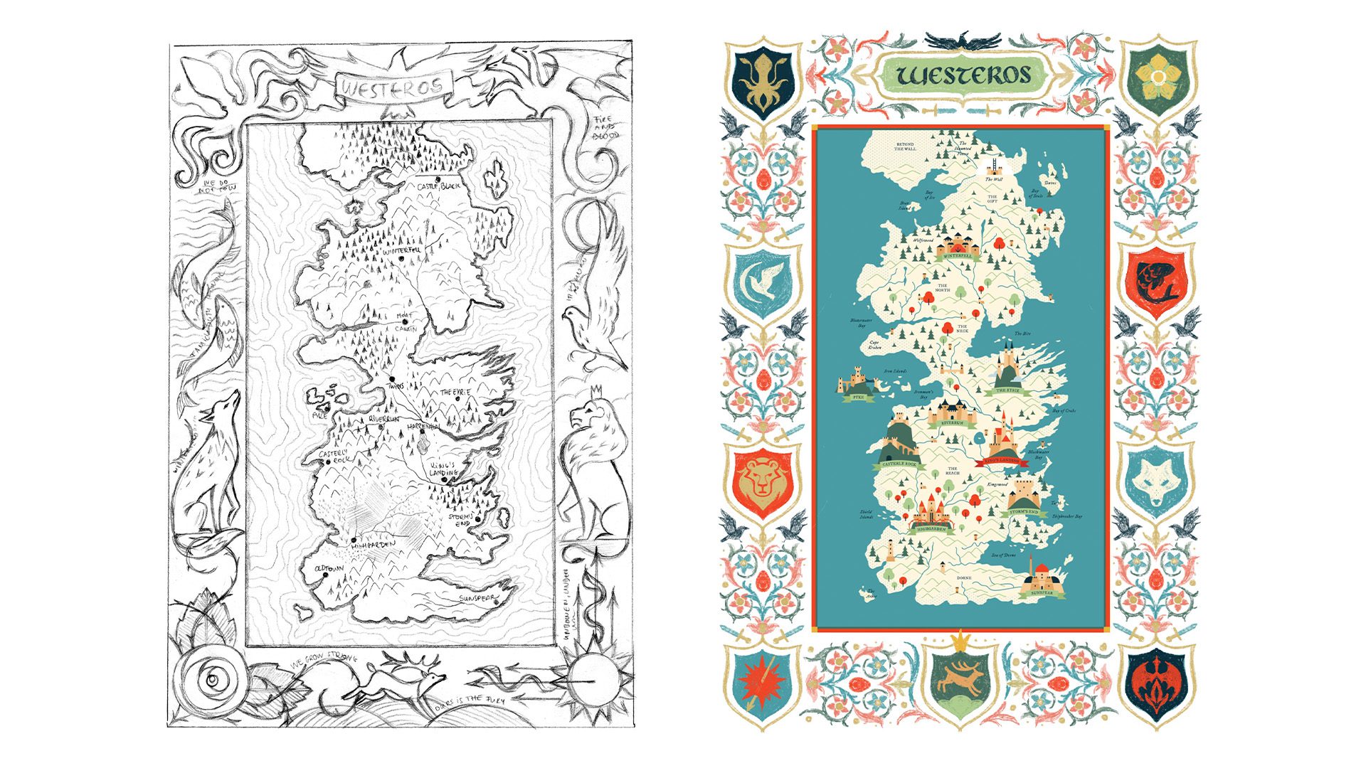
After research I continued with layout. For real life locations Google Maps is a life safer. For this project I used the published map of Westeros created by Jeffrey L. Ward as reference.
My first try on this was a lineart drawing which I liked a lot but I felt that it didn’t match my initial concept and my style. After a lot of struggle and uncertainty I started out fresh with a different design. (Can you spot the Easter eggs on the border?)
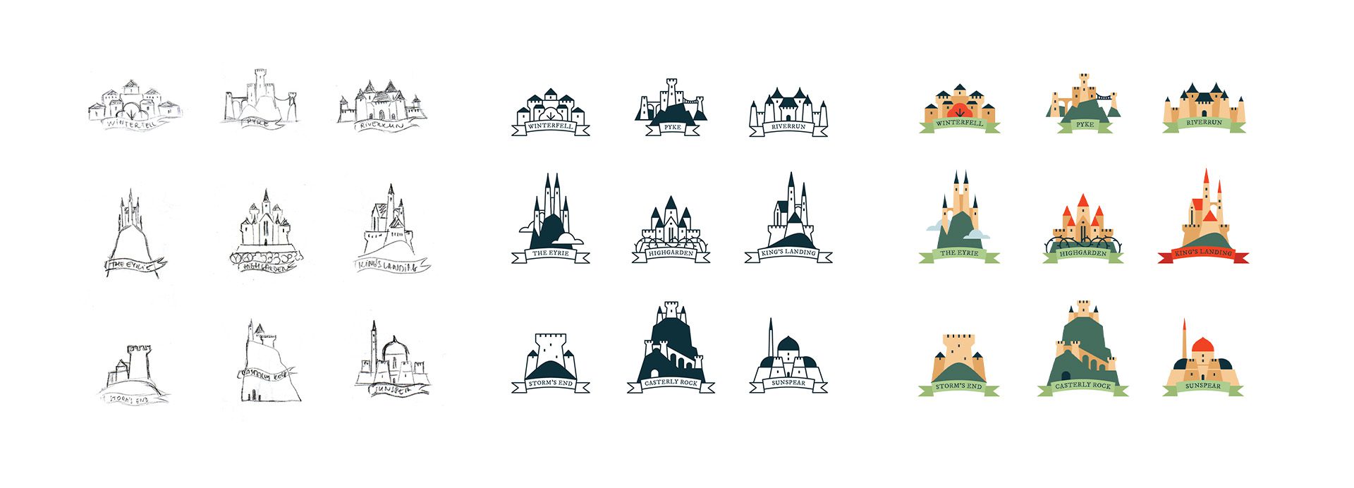
In the world of Westeros there are nine main royal houses that I wanted to show on the map. I created the seat for every house and added their coats of arms on the border.
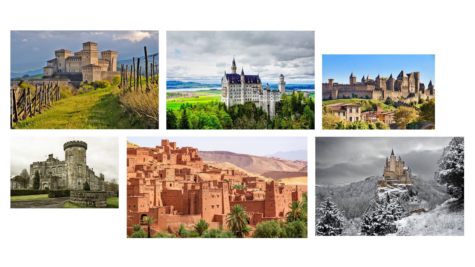
Making the little cities of this map was my favorite part. I used tons of reference from real castles and forts around every part of Europe to get the designs right. I am very pleased with how they turned out.
When designing points of interests I always try to be cohesive with reusing shapes for example the windows or ribbons on the city icons. The same is true for the terrain elements. I made a system of mountains, hills, trees and small castles and used the same shapes everywhere. This a helps a lot with the readability and understanding of the map.
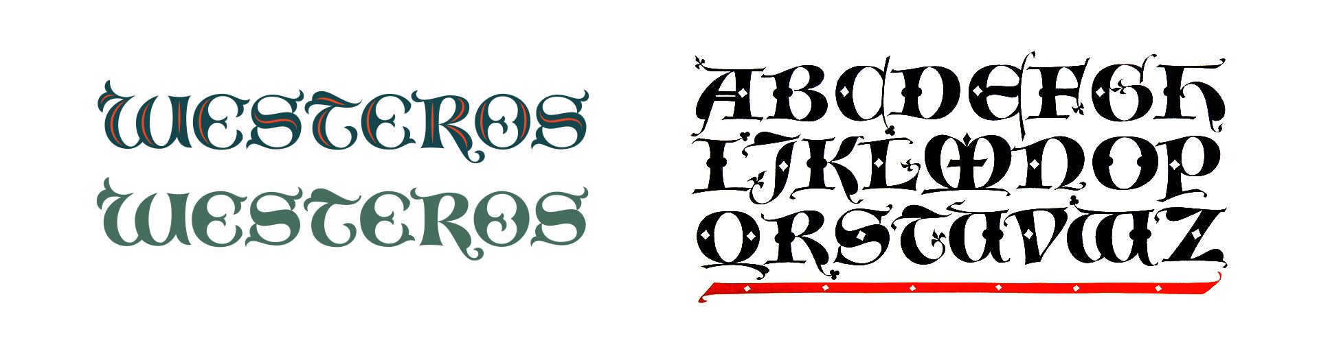
The typography on this one was not easy. I wanted to make a lettering piece that is modern and still has a medieval feeling to it. After a lot of trial and error I found the work of Hermann Zapf. With a little tweaking I used this lettering on the title.
As I mentioned before the main inspiration for colour and texture came from the medieval maps. In that time period colours were limited to pigments so I used only five basic colours on the map and some handmade textures in Photoshop.
Overall making this map was a huge project but I loved almost every part of it. I hope you liked this blog post of my process. If so, let me know if I should do more of these in the future.
Have a beautiful day,
Laura
By using my website, you agree to my use of cookies. I use cookies to provide you with a great experience and help the website run effectively.